Getting Organized for New Artist Website
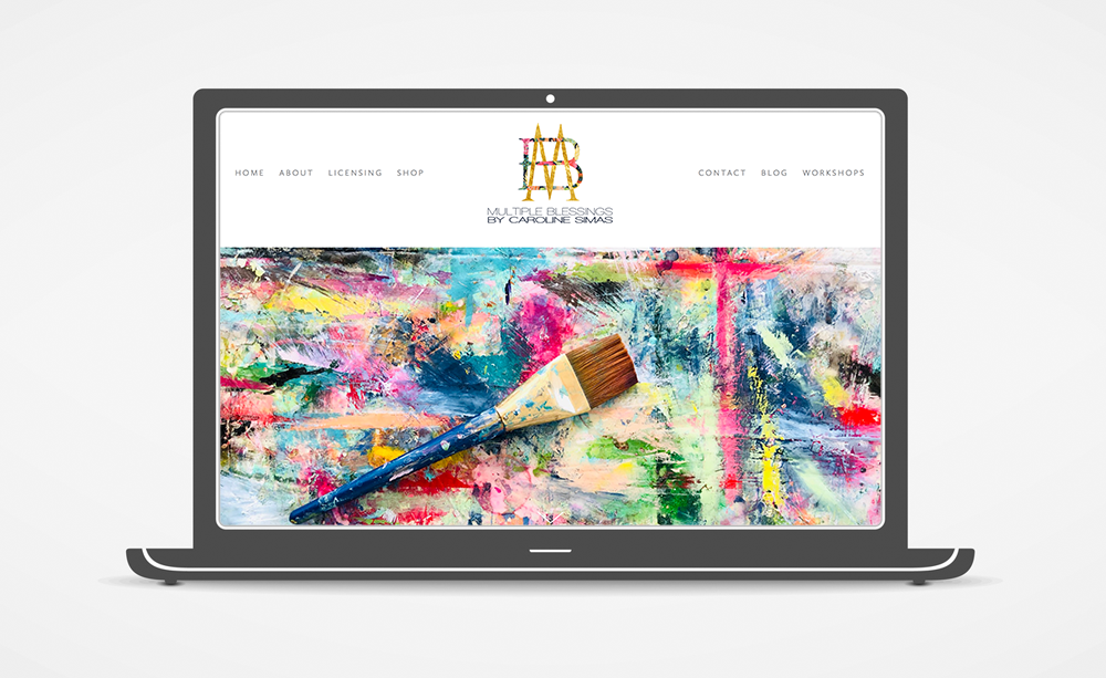
Some of my favorite clients are artists, designers, and other creatives. As a long-time creative and aspiring painter, I get a huge charge out of the collaborative creative energy of helping artists to market their work, and I have worked with dozens of artists over the last 15 years. From that experience, I understand well the overwhelm that can come from trying to organize and implement a portfolio website, especially when you would prefer to focus on your art!
For artist websites (and most others), I am a big fan of Squarespace. Squarespace is a hosting and design platform that is an excellent DIY solution for those that want to manage the entire process themselves. They continually offer new features and beautiful, on-trend templates, and if your needs are simple and you like the template just as it is, DIY is doable.
Not everyone is up for designing their own website, however, and I can help those that want some hand-holding, or wish to turn over the whole project to a professional. A designer can help you determine the purpose and goal of your site, choose the template that best suits your needs and your style, and then customize the look and function of the site to fit your brand. In addition to style and design decisions, a designer can be a big help in managing the project and getting your site launched -- organizing and selecting your content, preparing images for presentation, building out pages, and tending to the behind-the-scenes technical details.
Where to start?
Whether you are going to attempt a DIY or wish to engage a designer like me to create your new website, there’s some homework to do to get your project off on the right foot. Here, I’ve gathered some of the questions that I usually cover in my initial conversations with a new client.
Research
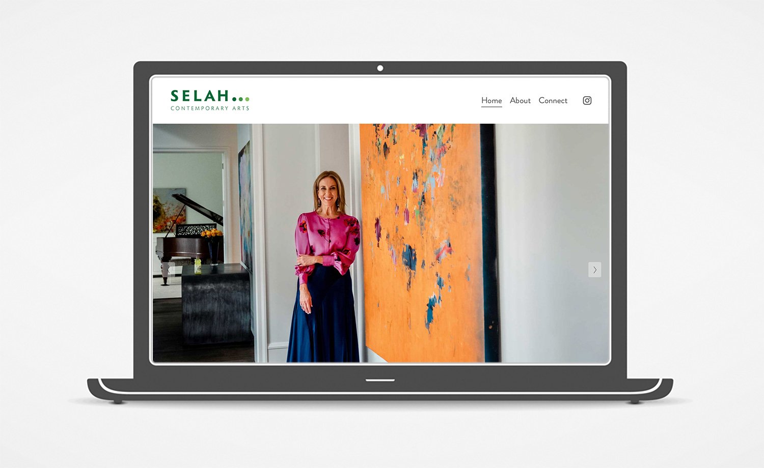
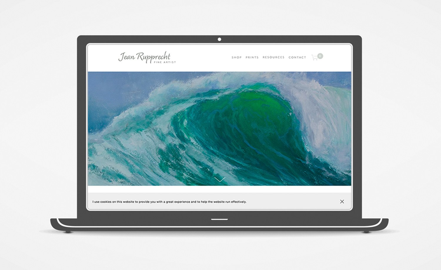
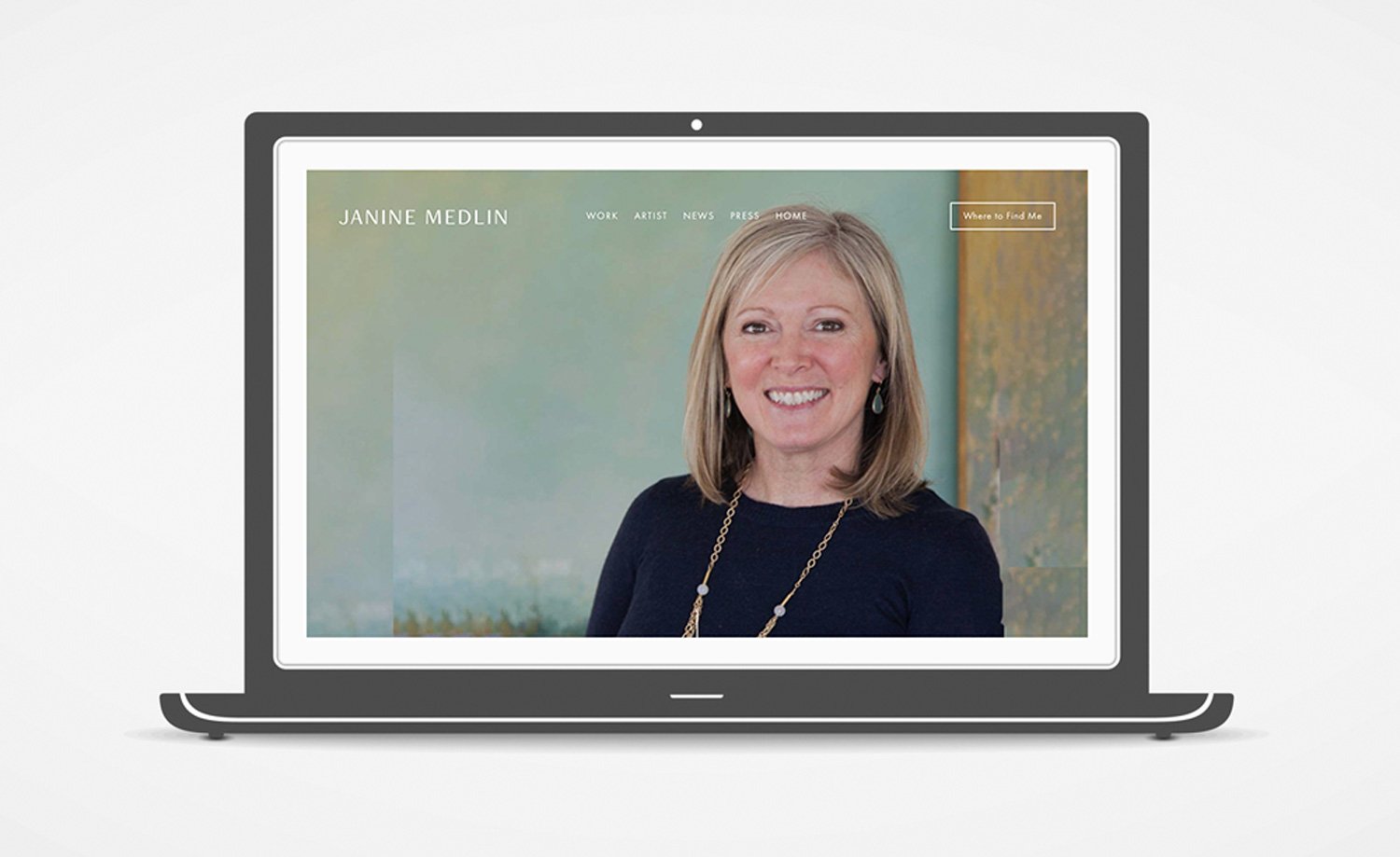
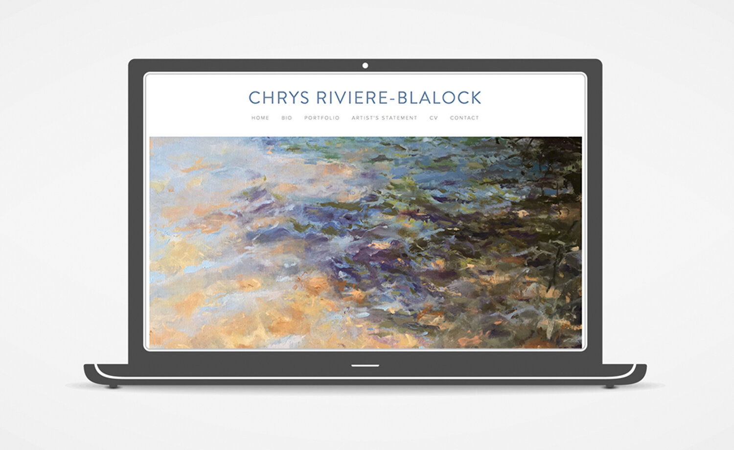
Spend some time looking at the websites of other artists, whether they work in your medium or not, and gather links to sites that appeal to you. (Or any relevant, non-artist website)
Make note of what you like about those sites:
Look & Feel? — color schemes, fonts, general style
Layout and Page Organization?
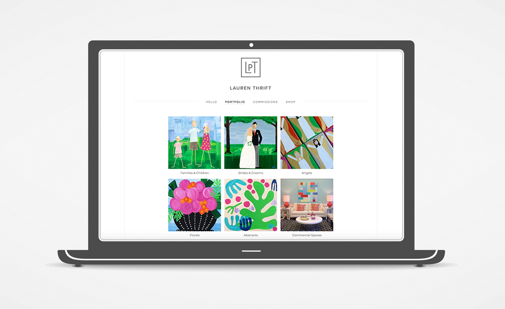
Portfolio Presentation? — limited work vs. comprehensive portfolio, displayed in thumbnails vs. slideshow, sorted into categories vs. all in one gallery
Are there particular functions or features you might like to emulate?
See things you DON’T like? That’s helpful info, too! Making note of some examples of sites that are not your style or features you find annoying will be useful in narrowing down the templates that will work best.
Pinterest can be helpful way to collect links and notes as you research, and can easily be shared with your designer for collaboration. (TIP: Make your Website Research Board *PRIVATE* to keep your collected images and notes from being publicly accessible.)
Getting Content Organized
Artwork: Start gathering photos of your work, possibly sorted into categories, and make note of your favorites that you might like to use in featured positions. Creating a series of folders on Dropbox or Google Drive is a great way organize and share images with your designer.
About You: Start working on your Bio, or dust off an old one and think about how you need to update or refine it.
Photography: Do you want to include photos of yourself on the site? Gather potential images or make an appointment with a photographer to get some fresh images you can be proud of. Headshots and portraits are great, but it’s also nice to have some images of you working, your studio, and your work hanging in finished spaces.
Site Functionality and Pages Needed
Do you want to sell work from your site?
Do you want a blog and/or a page for event announcements?
Other information we’ll discuss in our first meeting:
If you have a current website, how much of it do you want to keep?
Do you have any existing branding or logo? Are there styling elements like colors or fonts that you have used in previous marketing that you would like to be consistent with?
Are you on social media? What sites do you want to connect and/or promote on your website?
Time frame? Do you have a deadline you are trying to meet?
WHEW! That sounds like a lot, I know. You don’t have to have all of these puzzles solved before you begin, but thinking through your needs and preferences ahead of time, and having a task list on the content you need to be gathering, can be a huge help in making your website design process efficient and effective.
Ready to get started?
Contact me via email and we’ll get a consultation scheduled. Once I understand your unique needs and preferences, I’ll estimate your project, and we’ll get moving toward launching your new site!

